A Blank Czech

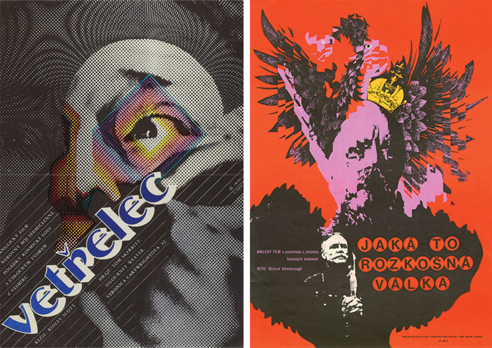
Czech film posters are a curious, beguiling piece of graphic design history. These posters for Alien and Oh! What a Lovely War are pretty cryptic and perhaps you're thinking that they don’t really represent the product they're selling? That’s because largely, they weren’t meant to. Well, of course they were meant to, but the designers who created these posters in Soviet Czechoslovakia had no intention of hard selling the films they depicted.
Then
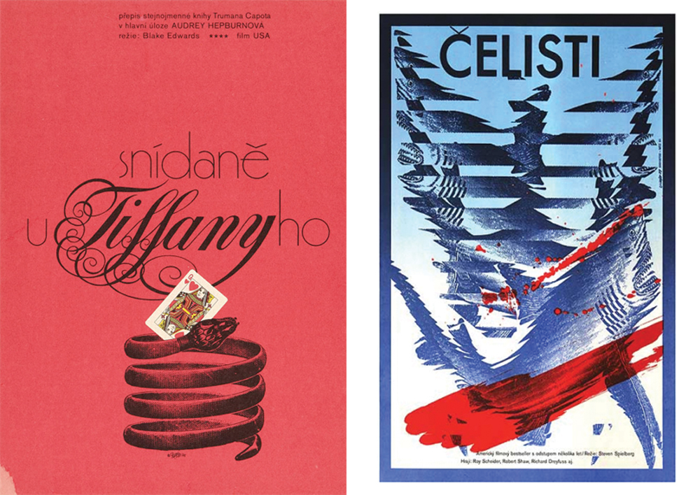
Behind the Iron Curtain between 1945 and 1991, the state suppressed private enterprise, including the exhibition and sale of artists work. However, officially sanctioned by the Central Film Distribution Centre and unbound by the constraints of a commercial distributer, like-minded designers such as Zdeněk Ziegler, Karel Vaca and Wolfgang A. Schlosser used their professional influence to collectively pry open the gates to complete creative freedom. The result, these wonderfully avant garde and often unintelligibly surreal posters. Even posters seen as cultural icons in the west like Jaws and Breakfast at Tiffany’s were treated as any other, offering a glimpse of an alternative history in pop culture. While the west used schmaltzy celebrity-centric adverts, the Eastern Bloc was far more evocative. Using styles derived from post-expressionism, neo-constructivism, dadaism and pop psychedelia, Czech designers created a subversive vehicle for free expression that, in the eyes of the state, was just an anti-West fuck you.
It’s easy to pour scorn on these posters, but we have to remember a couple of things. Often, the designer may only have had a handful of stills and a film title before starting work. Secondly, Western movies were seen as inherently interesting events that could guarantee a full house; the poster was merely a way of signalling it’s release, rather than trying to convince the public it was better than the next film.
Now
In 2015, the wall is down, Czechoslovakia is two countries and their era of enigmatic, thought provoking film posters has all but disappeared. In a largely capitalist world, highly focused advertising has become standard practice for the studios of Hollywood. Often, current poster design is so explicit about the themes and ambience, it inhibits the films ability to shock, surprise or delight (Yes, Transformers: Age of Extinction we’re talking about you) and perhaps that’s the point. In a post-recession culture of high accountability this may just be an aggressive form of brand management; PR and marketing departments shy away from advertising that is highly creative as it may be seen as high risk. Hell, it is risky.
There's still hope
Smaller independent film makers are relying on more sophisticated and creative ways to represent their work. As a notable and recent example, check out Faser Muggerage Studio’s arresting posters for Daniel & Matthew Wolfe’s 2015 film; Catch Me Daddy featuring dark, jagged typography intertwined with surreal artwork by New York-based artist Mu Pan.
Perhaps a more harmonious balance struck between creatives and the strategists could create an environment where a marketing campaign gains momentum through intrigue and mystique. The results could be astonishing, delightful and new.
Posters featured above
Alien/Vetřelec – Zdeněk Ziegler 1982
Oh! What a Lovely War/Jaká to Rozkošná Válka– Rudolf Altrichter, 1969
Posters featured below
Breakfast at Tiffany’s/Snídaně u Tiffanyho – Zdeněk Ziegler 1972
Jaws/Čelisti – Zdeněk Ziegler, 1987
Short Circuit/číslo 5 zije – Zdeněk Vlach, 1989
The Pink Panther Strikes Again/Růžový Panter Znovu Zasahuje – Zdenek Ziegler, 1978
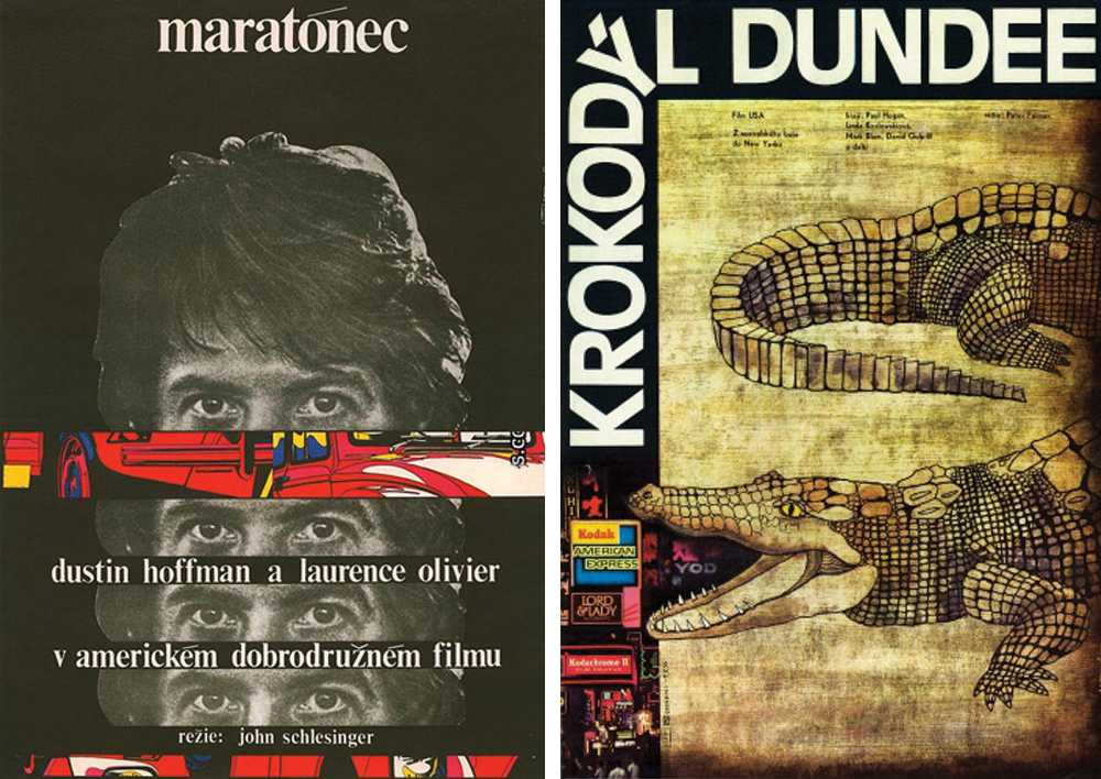
Marathon Man/Maratónec – Milan Grygar, 1977
Crocodile Dundee/Krokodýl Dundee – Jan Tománek, 1984


